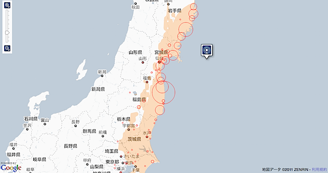

http://www.nytimes.com/packages/flash/newsgraphics/2011/0311-japan-earthquake-map/index.html
NewYorkTimesの特集記事。被害状況や、倒壊家屋の被害状況などがインタラクティブマップになってまとめられています。
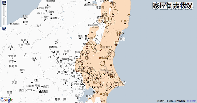
http://www.nytimes.com/interactive/2011/03/11/world/asia/maps-of-earthquake-and-tsunami-damage-in-japan.html?ref=asia
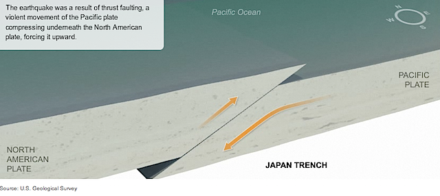
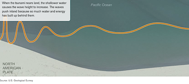
断層と津波のメカニズムの解説

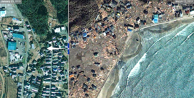
津波被害の前後がスライドで比較できます。
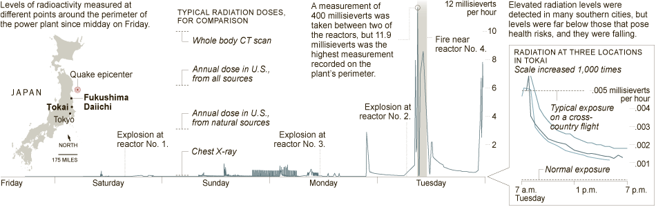
http://www.nytimes.com/interactive/2011/03/16/world/asia/20110316-japan-quake-radiation.html?ref=asia
Radiation at Fukushima Daiichi and 75 Miles Away
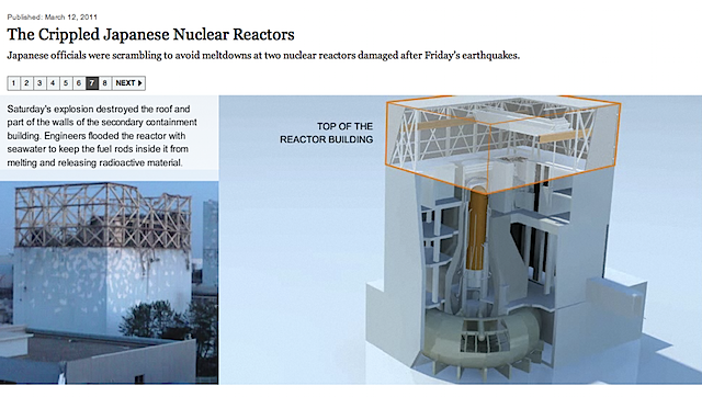
http://www.nytimes.com/interactive/2011/03/15/world/asia/daiichi-graphic.html


